The ROC Curve is a plot of values of the False Positive Rate (FPR) versus the True Positive Rate (TPR) for all possible cutoff values from 0 to 1. See Logistic Regression Classification Table for further information.
Example
Example 1: Create the ROC curve for Example 1 of Comparing Logistic Regression Models.
The first portion of the analysis from Comparing Logistic Regression Models is shown here in Figure 1.
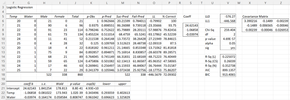
Figure 1 – Logistic regression data analysis
We begin by taking the observed values of success and failures in Logistic Regression summary format together with the calculated p-Pred values (i.e. columns H, I, and L from Figure 1) and sorting these by the p-Pred values. This can be done using Real Statistics’ SelectCols worksheet function as follows (referring to Figure 1):
=SelectCols(H6:L17,”5,2,1”,3)
The result is shown in columns AI, AJ, and AK of Figure 2.
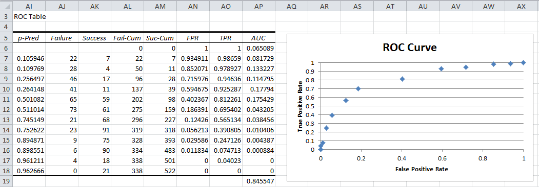
Figure 2 – ROC Table and Curve
Next, create the cumulative values for Failure and Success (columns AL and AM) and then the values of FPR and TPR for each row (columns AN and AO). E.g. these entries for row 8 are calculated via the following formulas:
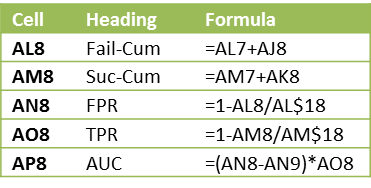
Figure 3 – Selected formulas from Figure 2
The ROC curve can then be created by highlighting the range AN6:AO18 and selecting Insert > Charts|Scatter and adding the chart and axes titles. The result is shown on the right side of Figure 2. The actual ROC curve is a step function with the points shown in the figure.
Observation
The higher the ROC curve the better the fit. In fact, the area under the curve (AUC) can be used for this purpose. The closer AUC is to 1 (the maximum value) the better the fit. Values close to .5 show that the model’s ability to discriminate between success and failure is due to chance.
For Example 1, the AUC is simply the sum of the areas of each of the rectangles in the step function. The formula for calculating the area for the rectangle corresponding to the p-Pred value in row 8 (i.e. the formula in cell AP8) is shown in Figure 3. The formula for calculating the AUC for Example 1 (cell AP19) is =SUM(AP6:AP18). The calculated value of .845587 shows a pretty good fit.
Data Analysis Tool
The Real Statistics Logistic Regression data analysis tool automatically creates the ROC curve as described above.
Examples Workbook
Click here to download the Excel workbook with the examples described on this webpage.
References
Wikipedia (2013) Receiver operating characteristic
https://en.wikipedia.org/wiki/Receiver_operating_characteristic
Kaggle (2023) Classification table – confusion matrix. Logistic regression using R
https://www.kaggle.com/code/benroshan/part-8-logistic-regression-using-r
MedCalc (2023) ROC curves
https://www.medcalc.org/manual/roc-curves.php
there would be the possibility of including machine learning models such as: naive bayes and support vector machines
Hi Antony,
Thanks for your suggestions. I will add these to the list of potential future enhancements.
Do you have a good reference for these topics?
Charles
ADJUNTO REFERENCIA:
https://web.iitd.ac.in/~sumeet/tr-98-14.pdf
adjunto otra reference:
https://www.youtube.com/watch?v=ZwGaLJbKHiQ&t=21s
the area under the curve comes out different from the stata and gretl
Hello Antony,
Can you give me an example where the AUC is different?
Charles
stata uses the Mann-Whitney statistic for the calculation of AUC
Sir, I have got data and randomly split in to 70% and 30%. How should be ROC curve constructed? Means should the curve be constructed on 100% data or should it be constructed on 30% Data based on the probabilities obtained from the model developed using 70% of the data?
Can u suggest me the methodology generally followed sir?
Hello Sai,
The answers to these questions are fairly similar to the answers I have provided to your previous questions. You can generate the ROC for all three possibilities.
Charles
Sir, I got auc value for 100% sample as 0.823. Where as for the predicted probability data on 30% data based on 70% data as 0.679. Both the accuracy of 70% data and 30% data was over 80%. Can I report accuracies of 70% data and 30% data as there can be error in shrinkage of 2% and AUC of overall data?
Sir, I got one more doubt, In case if we do cross validation, how to get ROC curve?
You generate the ROC in the usual way. ROC only depends on the specific data you use. You need to decide which data set is most relevant; essentially this is based on why you want to generate the ROC in the first place.
Charles
Charles Sir, thank you for your valuable and timely suggestions with which I could complete my project. Thank you once again sir.
Hello professor,
just to let you know, the ROC curve data is not displayed using the Binary regression tool. I believe this is due to an issue with the SelectCols function as it doesn’t seem to produce any output (using Office 365 on Mac, version 16.35).
BR
Hello Filippo,
Are you using Rel 7.0 or Rel 7.0.1. The latter was released yesterday and was intended to address this issue. I tested it on two binary logistic regression examples sent to me by other users who had a similar problem.
If you are still having this problem when using the newer release, please email me an Excel file with your data and results and I will investigate the problem further.
Charles
Thank you for your prompt reply – the issue has been solved with the latest update.
I also happened to come across your bio and learnt you live in Trento – just like me. Hope you stay safe in these difficult times!
BR
Hi Charles,
I have generated a ROC curve and AUC in graphpad prism as I have continuous data (rather than binary) in both a control and treatment group. From the output I have then calculated Youdens Index to ascertain the cut off point that differentiates between the two states, this being 0.56. I now need to back calculate what value (in terms of concentration) the index is referring to, to give a meaningful result. I have read elsewhere to use a logistic regression equation to do this but am not sure of what variables to include or whether this is the correct approach. Would you be able to shed some light on this please.
The data that graphpad has generated includes; AUC, std error, 95% confidence and pvalue in addition to sensitivity, specificity and likelihood
Here is the link by Ivm that refers to a regression equ. https://communities.sas.com/t5/SAS-Statistical-Procedures/ROC-in-SAS-obtaining-a-cut-off-value/td-p/161354
Any assistance you are able to provide would be appreciated, thanks
Hi Nikki,
I am not that familiar with this topic. The following article may be helpful though:
www4.stat.ncsu.edu/~bondell/OptimCut.pdf
Charles
Hello,
This homepage helps me a lot! Thank a lot!
But I have got a question because of the interpretation.
If I have an auc value of 0.79. What does it mean? Let’s say I’ve got I risk assessment instrument which measures the risk of to be “red”… With an cut off of 10 my instrument would say that some one show the feature “red”.
Now my auc value is 0.79,
Does is it mean that if I choose randomly someone of the the “Red” population this person would have high scores on risk instrument? With a probability of 79 %?
Or does it mean the relative probability of my risk assessment instrument to discriminate between “red” and “not red” ist 79 %?
Or does it mean that my risk assessment instrument, can with a probility of 79% say that someone shows the feature “red”?
Hello Linda,
It is not so easy to interpret the AUC. The following webpage may help (especially the one marked with a 66).
https://stats.stackexchange.com/questions/132777/what-does-auc-stand-for-and-what-is-it
Charles
Hi
I have conducted a study where an imaging modality was used diagnose a disease and that was compared to a gold standard laboratory test. I used a “truth table” (2×2) table to calculate sensitivity, specificity, PPV and NPV. I not sure which values or how to reorganise my data to be able to use the values to create a ROC curve on excel. Please help
Thanks for your good tutorial.
I have a question:I’ve done some classification algorithms in weka software.Now I want to draw a ROC curve or PR curve according to weka results.How can I do it?
I am not familiar with weka, but as long as it can output a plain text file you can use Excel’s Data > Get External Data | From Text capability to get the data into Excel.
Charles
i dont know ,How to perform test set versus training set and its calculation.
I have a set of data. I want to calculate true positive and false positive. some pls say
Sorry, but I don’t understand your question.
Charles
Hey Charles,
Just a quick question. What are success and failure values? I have a set of data from which I calculated sensitivity and specificity. I have different cut-off values. I simply tried scatter plotting sen vs 1-spe but it did not create the ROC curve. Most of the points are clustered together. Am I doing something wrong?
Thanks!
It does sound like you have done something wrong, since the ROC curve should have a characteristic shape, but I would have to see your data to really be able to answer your question.
Charles
I am not sure how to post my data here but roughly, I have two groups (normal and positive). For each group, there are 80 samples. I calculated cutoff values for each ‘marker’, which I extracted from the raw data with my own methods. Then for each marker, I used the cutoff values to categorize each sample into either n (normal) or p (positive). For example, for one marker or cutoff value, I assigned n or p depending on whether the raw data value exceeds the cutoff or not. As you know, from this, I can calculate specificity and sensitivity.
Then for each marker (since each marker has its own cutoff value) I graphed sen vs 1 – spe.
Hi,
Congratulations, its a great blog!
My question is: I have 2 classifiers (A/B).The classificador A had a better accuracy and B a better AUC. So, which should I use?
Thank you so much!
Lizzie
Lizzie,
How are you measuring “accuracy”?
Charles
I have 3 methods to diagnose whether a segment of nerve is torn or not, I want to compare their diagnostic accuracies in correctly diagnose a torn nerve by comparing their ROC.
Jimmy,
I don’t current provide any means of comparing ROC’s in the software. Of course if the ROC are generated from my software they can be compared visually.
Charles
It is a good overall on how to perform ROC
Is there a way using Excel to compare diagnostic accuracies of three diagnostic methods using 3 ROC curves?
Jimmy,
I don’t completely understand your question. Can you give me an example?
Charles
Jimmy,
Probably, but I haven’t done this yet in my software. Another potential future enhancement.
Charles
Hi Charles,
I have been puzzled on how to organize the data in excel until I found your blog.
Its help, thanks !
Appreciate if you could answer my question. What if I am testing existing models i.e. logit/MDA (hence, using the same coefficient, plugged in the variables weight into the model), for that I only have the probability/scoring results. How should I perform/derive ROC from this results? Many thanks.
Rose,
Unfortunately the tool I created isn’t designed to do this. All I can suggest at this time is that you modify the spreadsheet I have provided in the Multivariate Statistics Examples file (which you can download for free).
Charles
ok, Charles.
thank you
Hi ..this is good example for me.,I have a question hope u don’t mind to answer.
If lets say, I have set of training data. Is ROC used to evaluate the threshold that I got fro this training data? If let say the ROC rate is 0.9, then this model of training and threshold data is good to test another data.?
Thanks
Raseeda,
An AUC value of .9 is quite high and so I would think that the model would be good enough to test other values.
Sorry that I haven’t responded sooner. I seemed to have overlooked your question until now.
Charles